Verigive
Role
UI/UX Designer
Category
-
- Non-profit/Donation
What I did
- User Research
- Information Architecture
- Wireframes
- Mockups
- Prototyping
- Logo Design
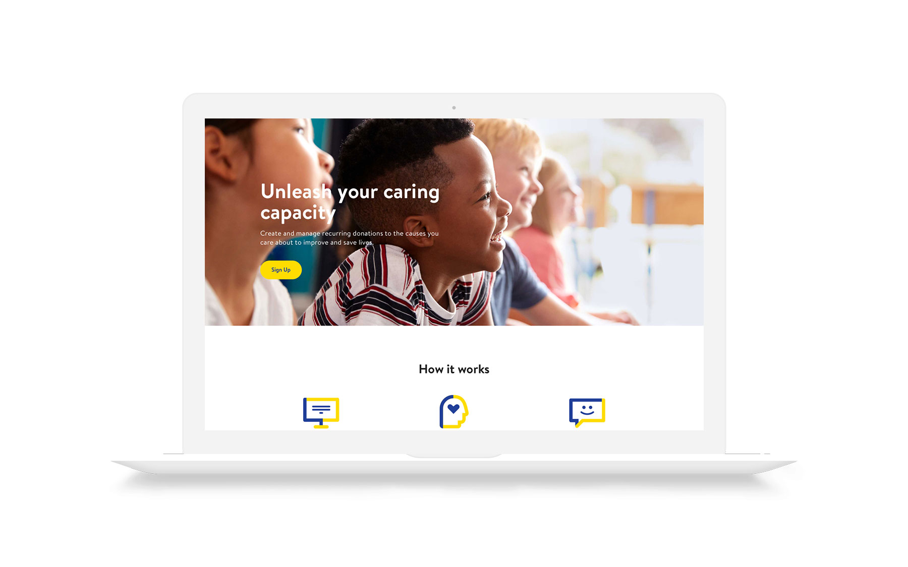
Unleash the caring capacity of individuals.
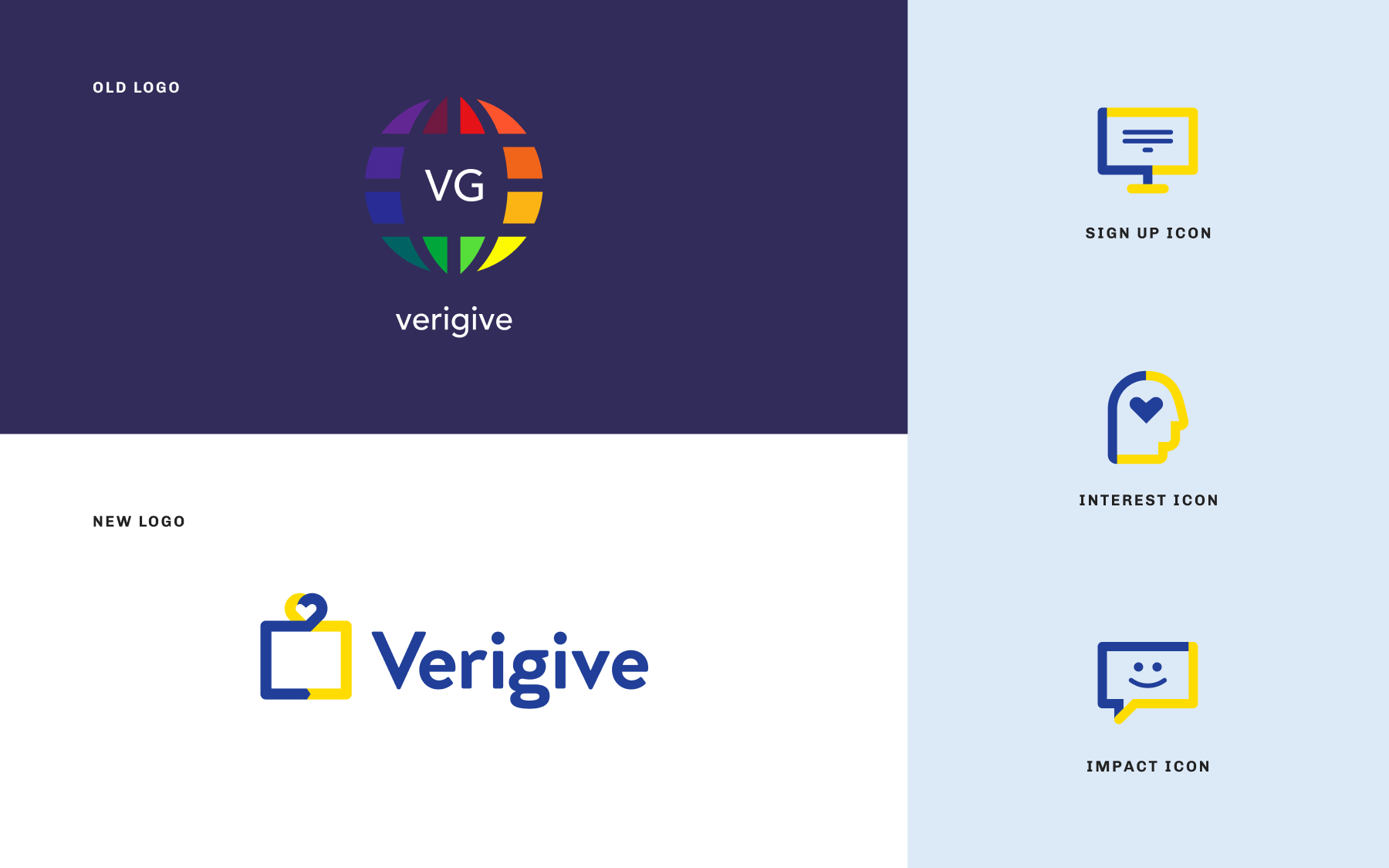
Verigive is a donation platform that enables you to commit to causes you care about the most and manage your impact. They partnered with United Way of Greater Los Angeles with the mission to activate individuals to care about philanthropy. Verigive provides an array of vetted opportunities for users to contribute to such as: Education, Housing & Homelessness, Community Issues and Human Services. The founder approached me to redesign Verigive’s logo, website and iOS app.
What wasn’t working?
Lack of awareness
There was a low awareness of Verigive among potential users and non-profit organizations.
Onboarding drop off
There was a high user abandonment rate during onboarding.
Recurring donations
There was a low number of donors using recurring donations.
Research
Before starting to design anything, it was important to research why people donate and also why they don’t donate. I learned that people donate because it feels good. When it comes to charitable giving, we are often ruled by our hearts and not our heads. A big reason that people don’t donate is because the organization feels untrustworthy. Trust is critical when it comes to charity. People won’t donate if they don’t trust an organization will spend their money on what they say they will.

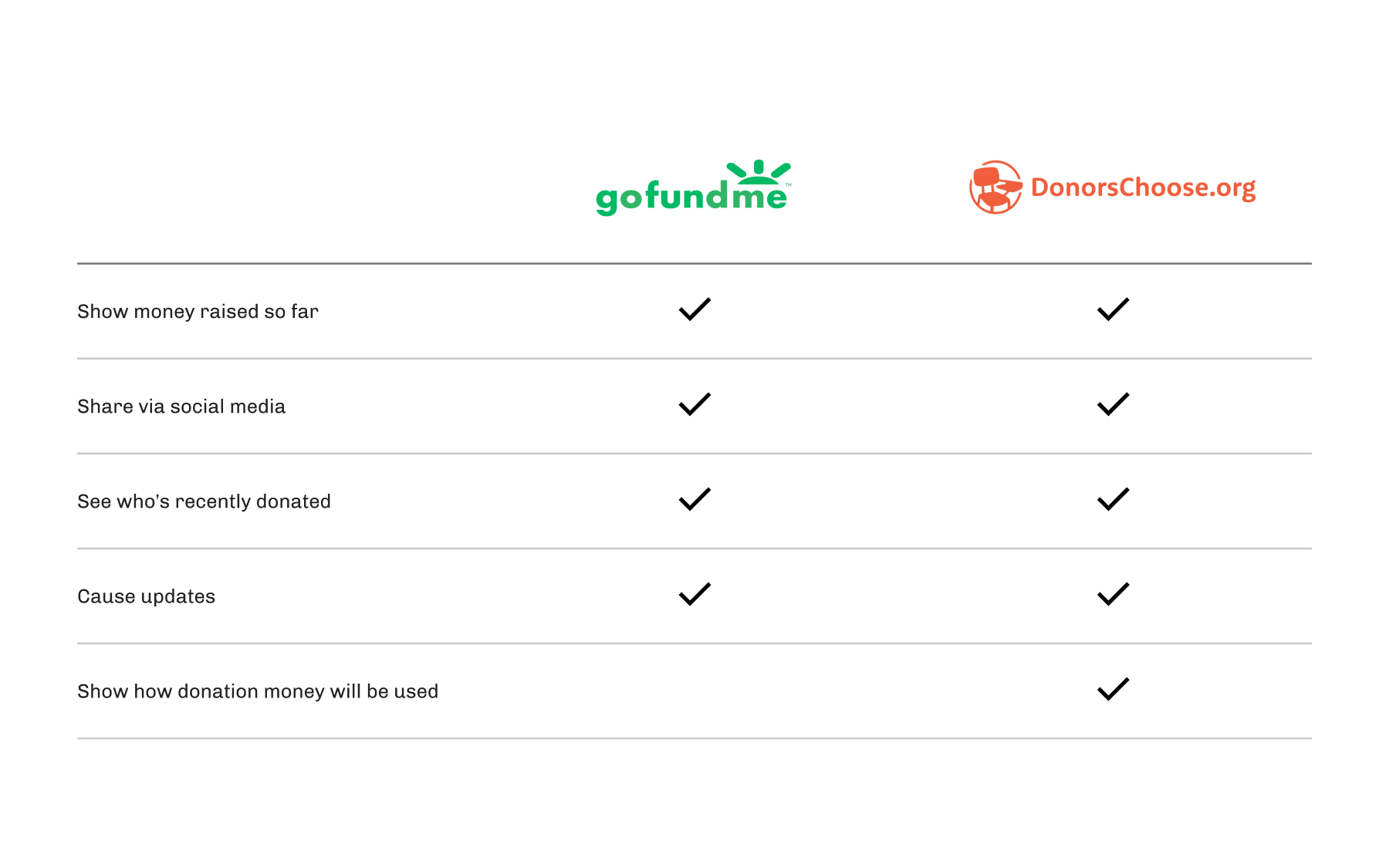
Competitor Analysis
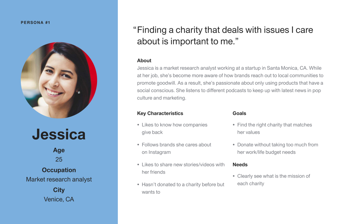
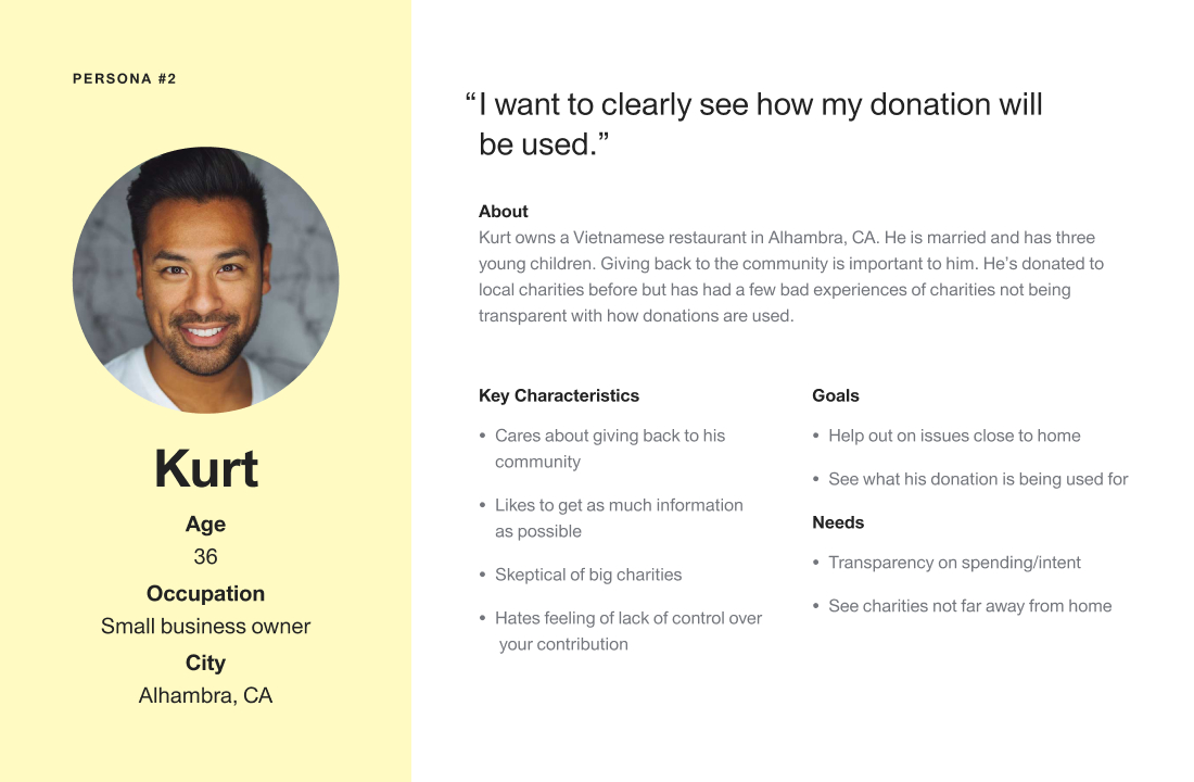
After creating personas for ideal users of the new site, I looked at various websites of companies in similar industries to see what they’re doing well and missed opportunities. The biggest competitors are GoFundMe and DonorsChoose. I explored the strengths and weaknesses of both sites to learn key things to keep in mind for the new Verigive site.
The new Verigive
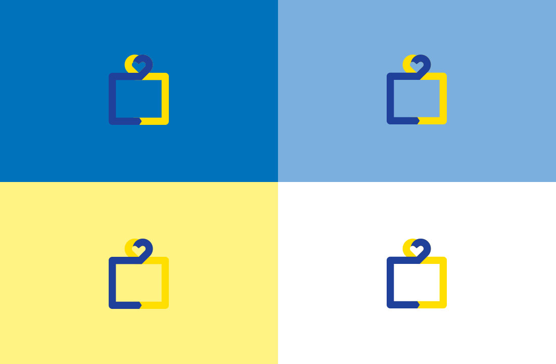
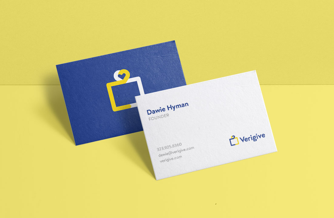
What makes Verigive special is that it’s focused on Individuals giving interests, allowing a committed form of recurring giving, and provides a feedback channel back to them on how their contributions helped. The new logo was inspired by my early research on donating. Specifically that we are often ruled by our hearts and not our heads. It visually shows a person’s giving capacity and the impact that it can have.

Opportunity #1
Hearts Over Heads
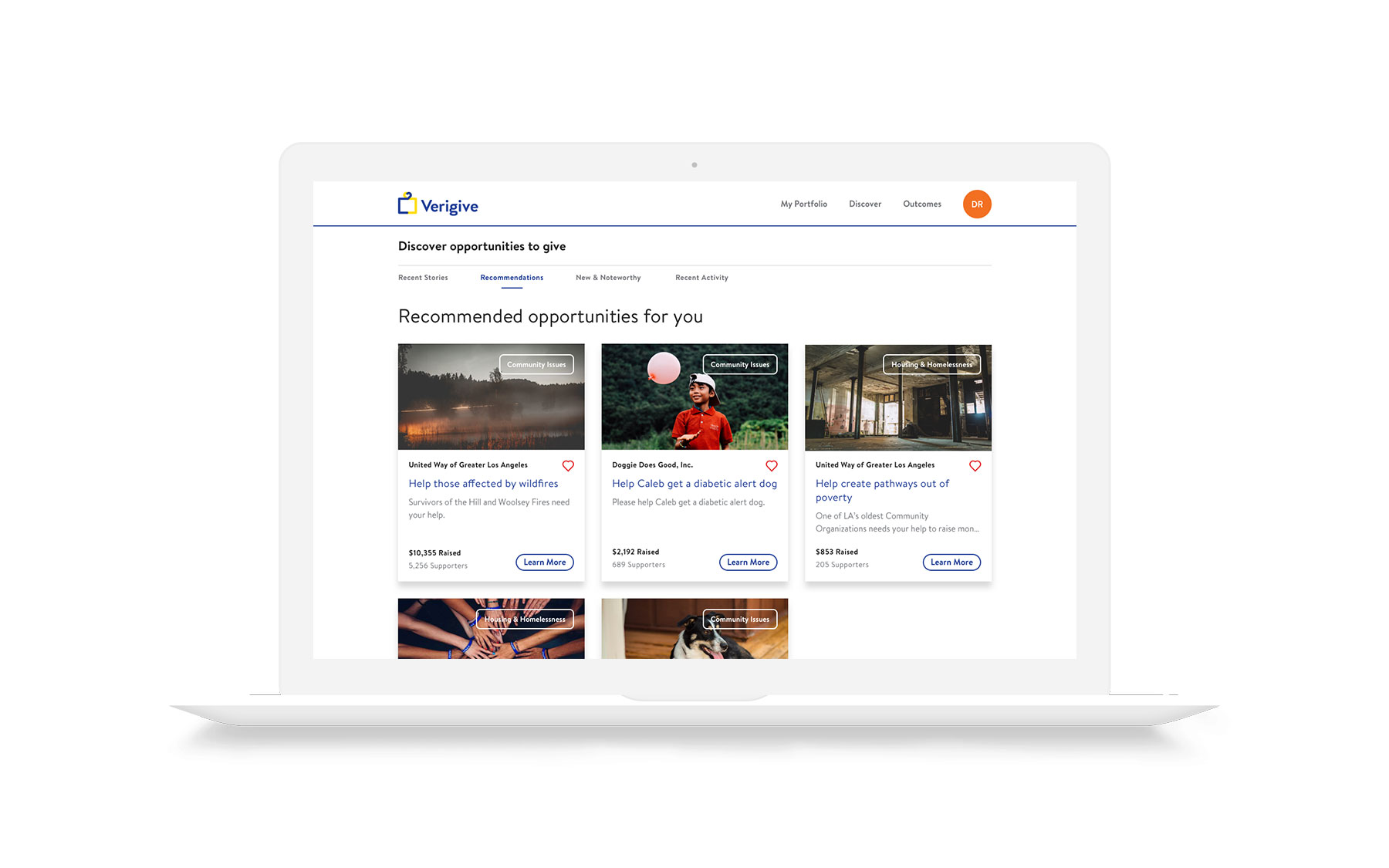
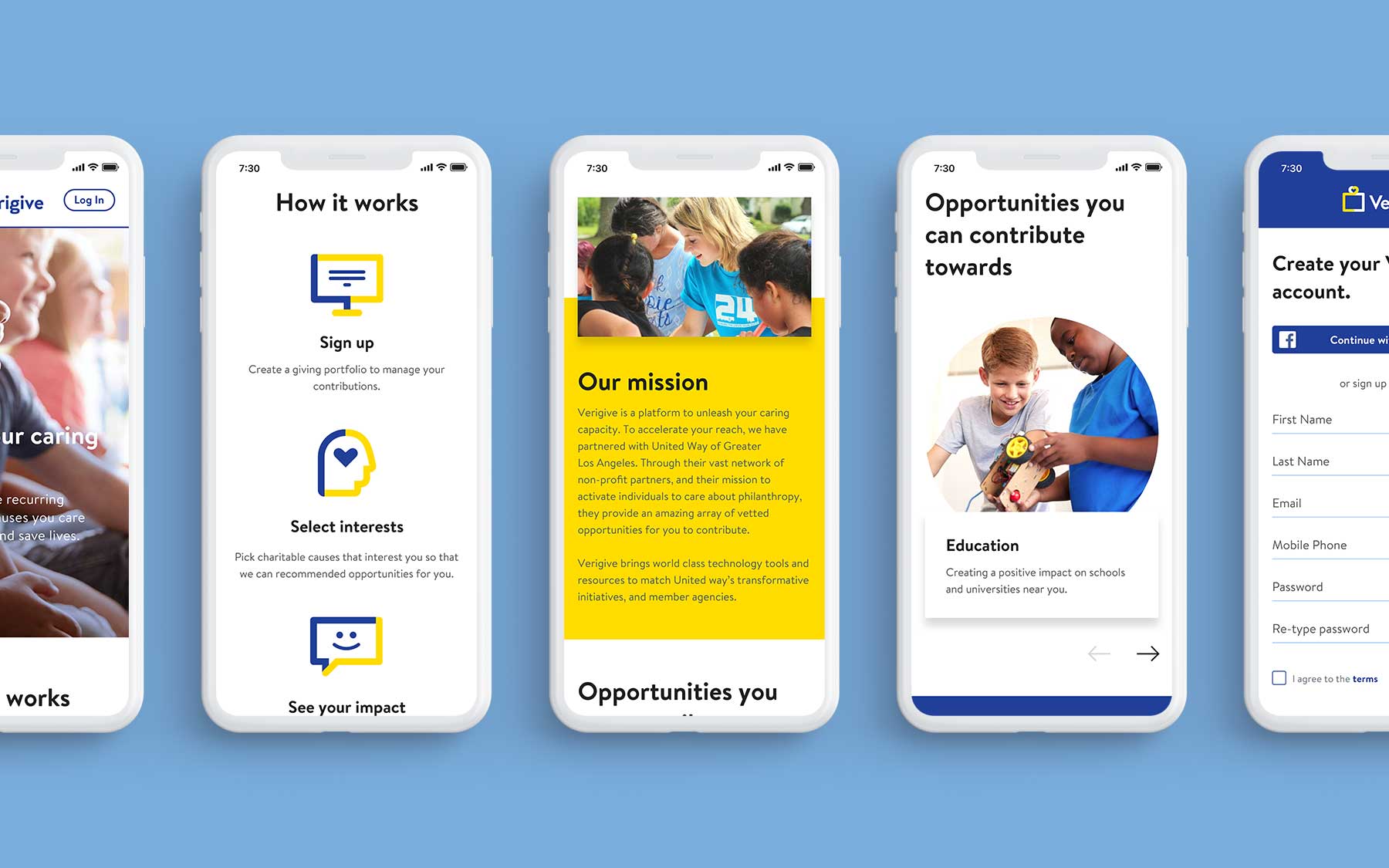
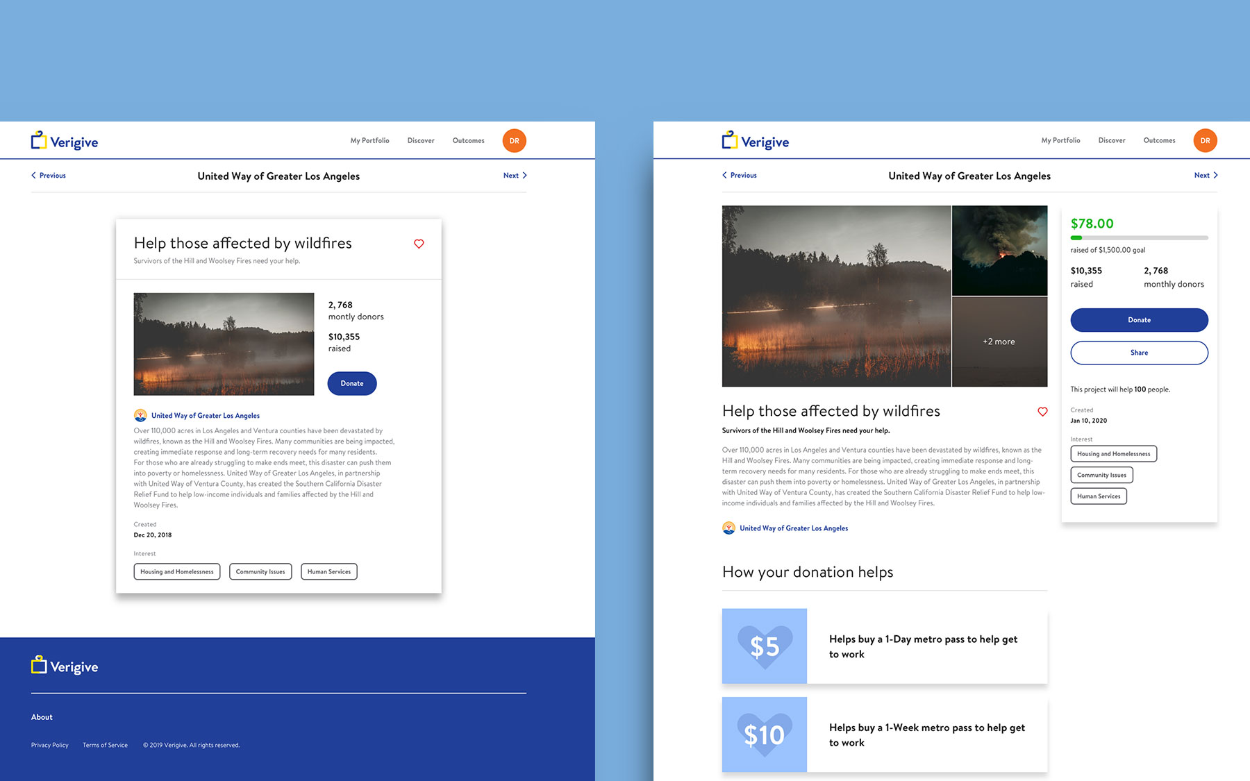
The old homepage didn’t help people learn more about Verigive and how it works. I saw an opportunity to tell Verigive’s story by including sections such as: how it works, about us and highlighting the different causes people can donate towards.
Opportunity #2
Make It Suuuuuper Easy
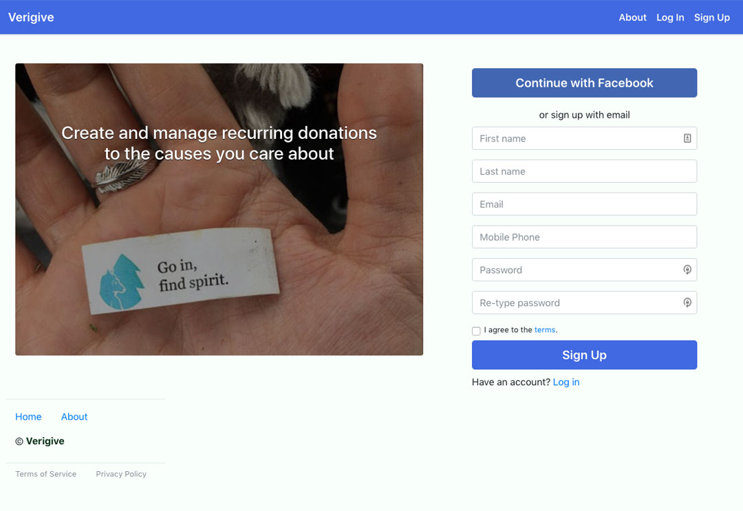
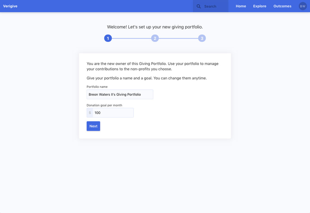
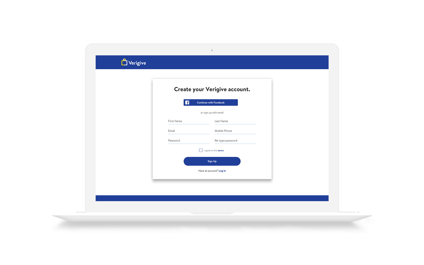
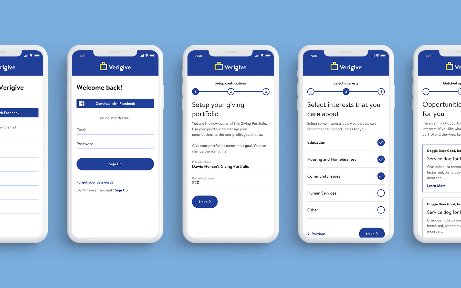
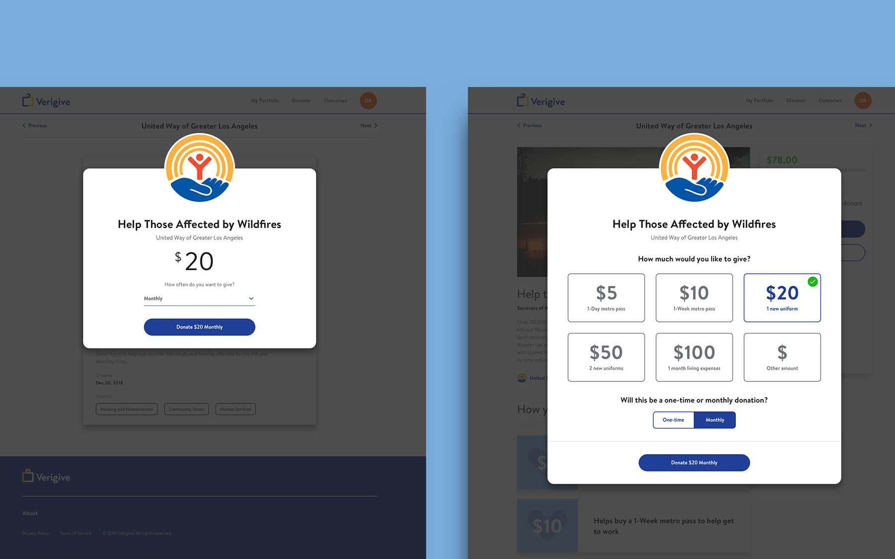
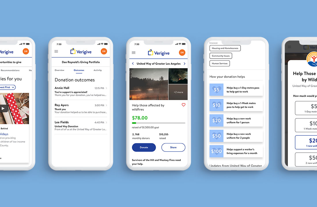
To fix the high user abandonment rate during onboarding, I focused on making information clearer. Previously, instructions and support copy all read at the same level. I fixed the hierarchy to ensure that the main point/action is easily visible at each point of the onboarding process. Also, I added titles of what the current page is above the on boarding step indicator. Care was also given to make CTAs more accessible.
Opportunity #3
Increase the desire to give
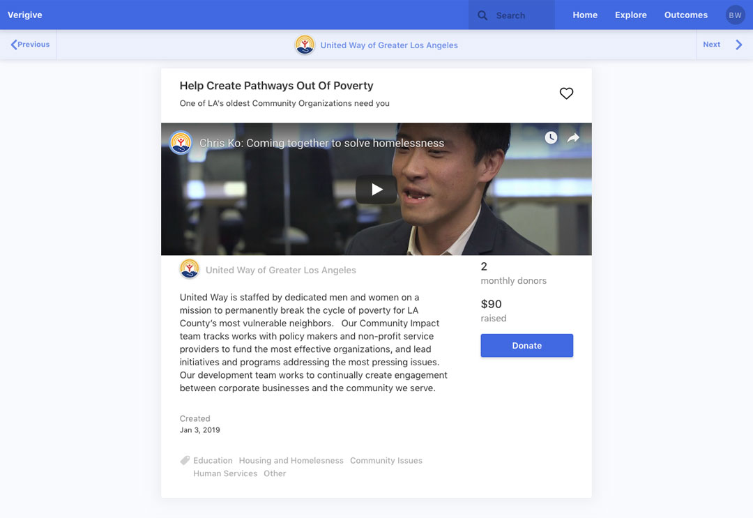
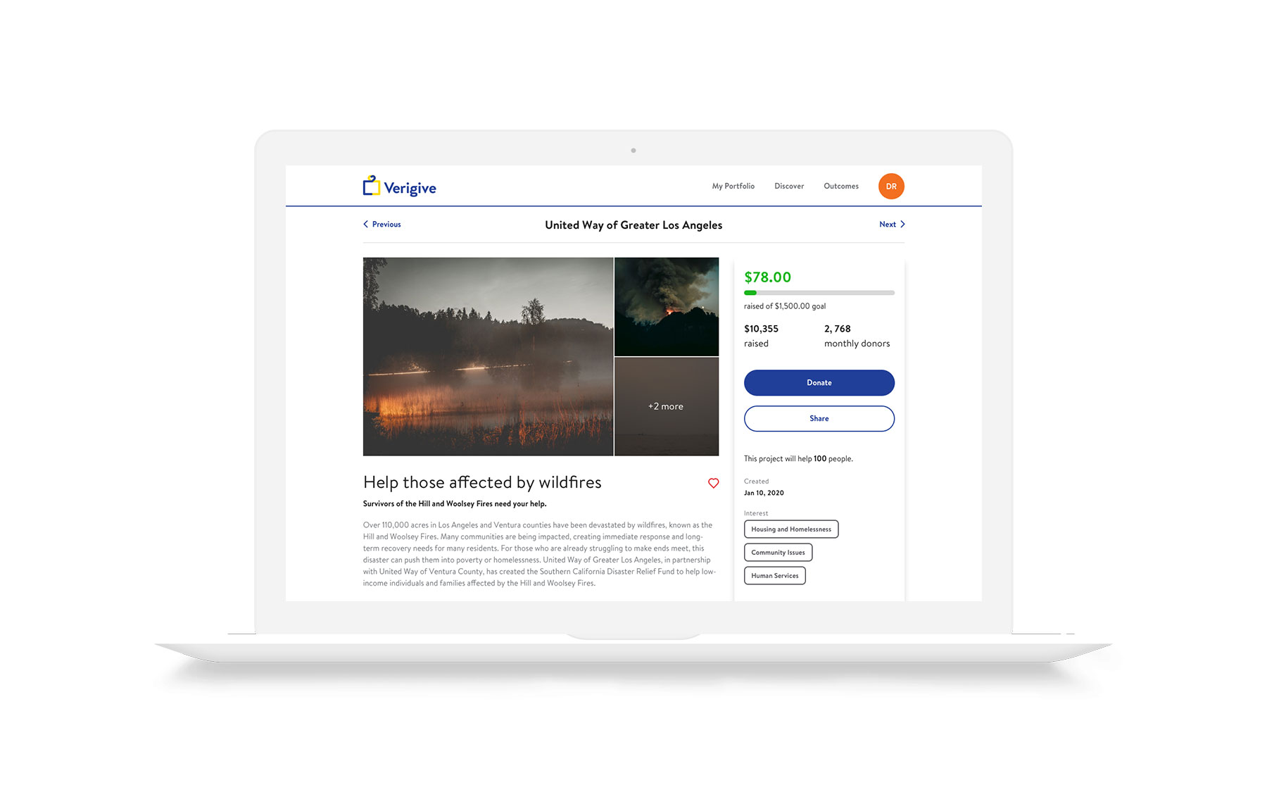
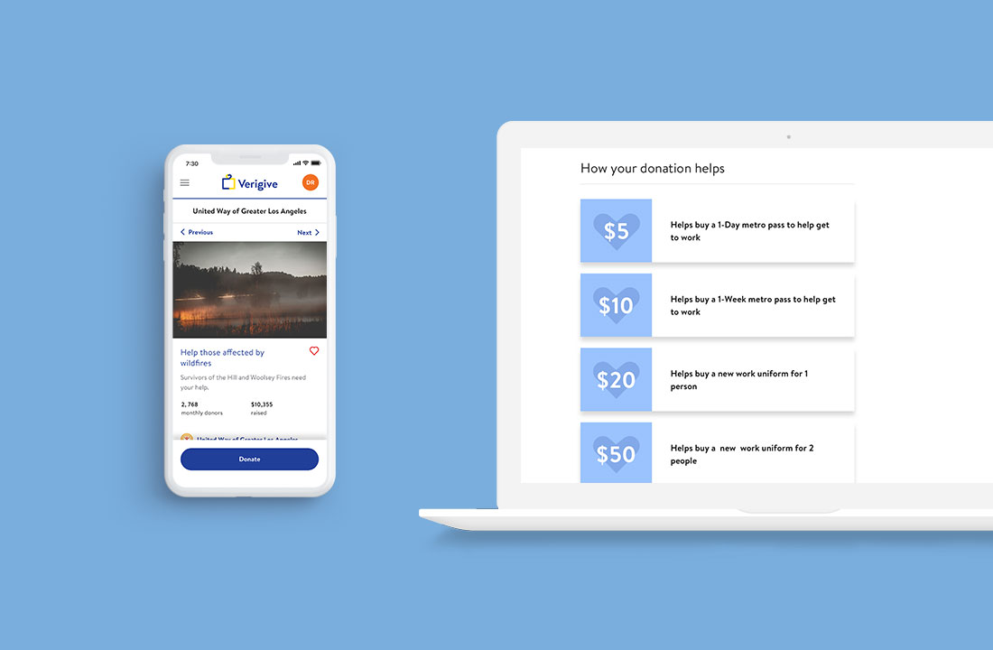
To help increase recurring donations, I focused on transparency and appealing to people’s hearts. To be fully transparent about one-time vs recurring donations, I improved the copy to be more conversational during the donation flow. Users are now asked how much they would like to give and if it will be a one-time or monthly donation. That way it is absolutely clear what a user is committing to before they donate their money.
Opportunity #4
All about the users
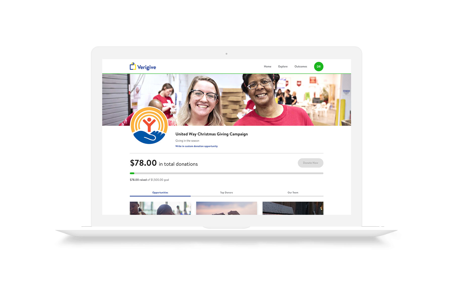
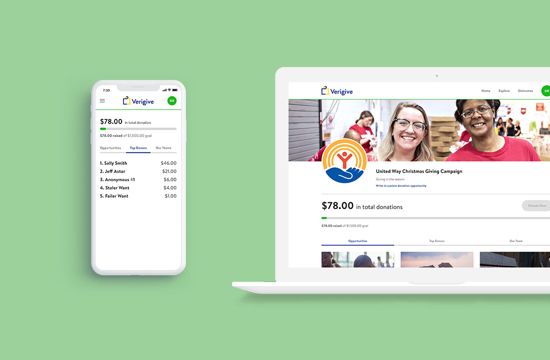
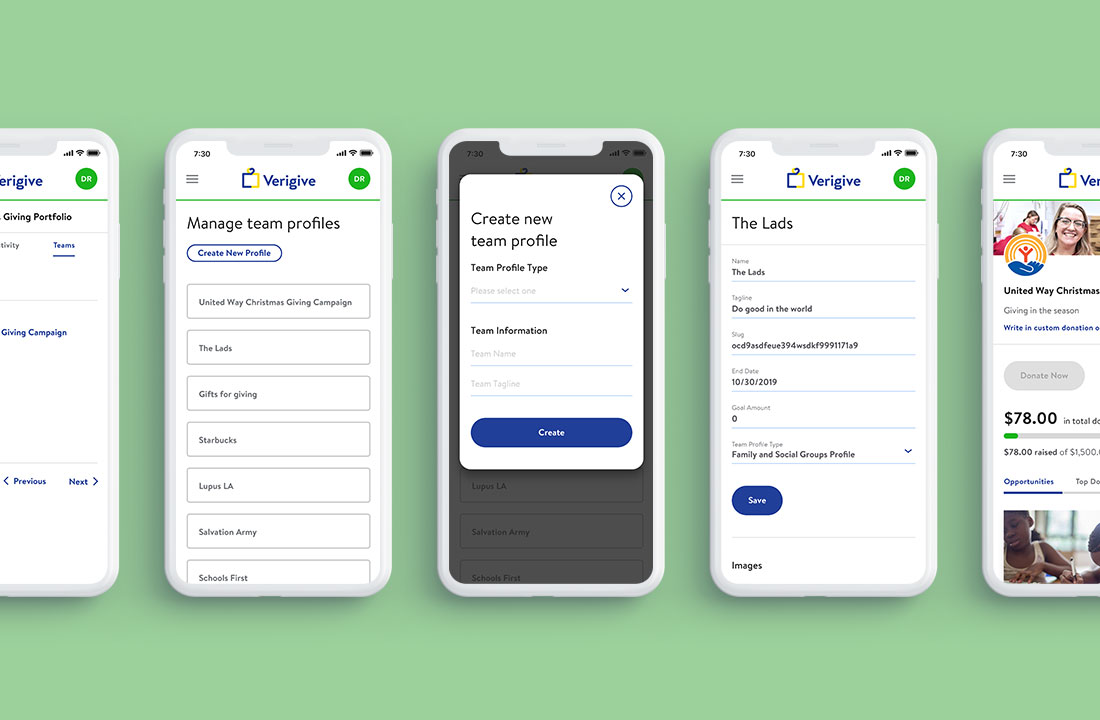
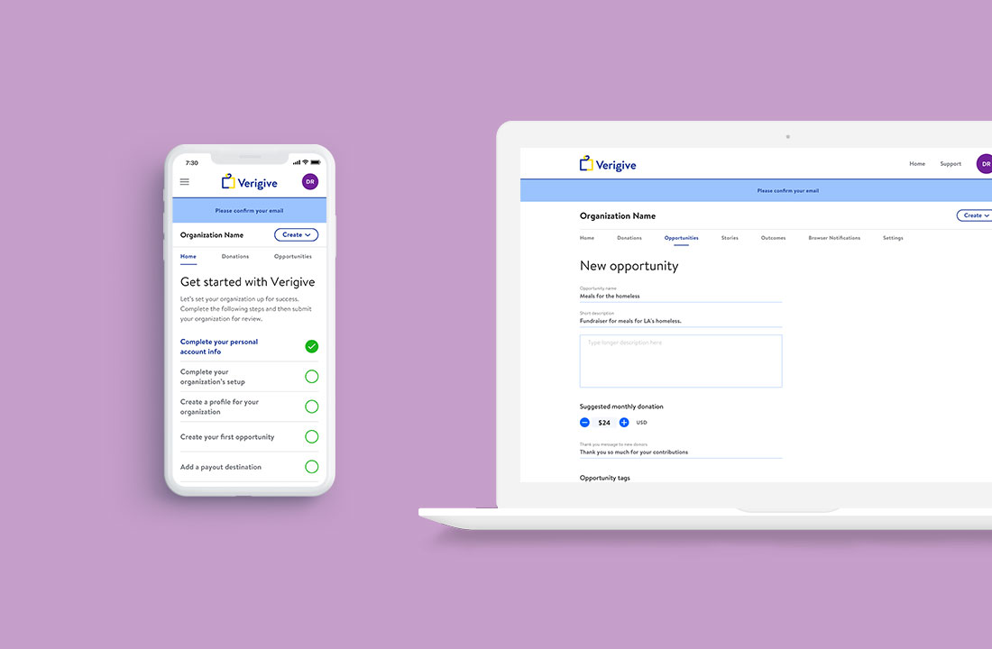
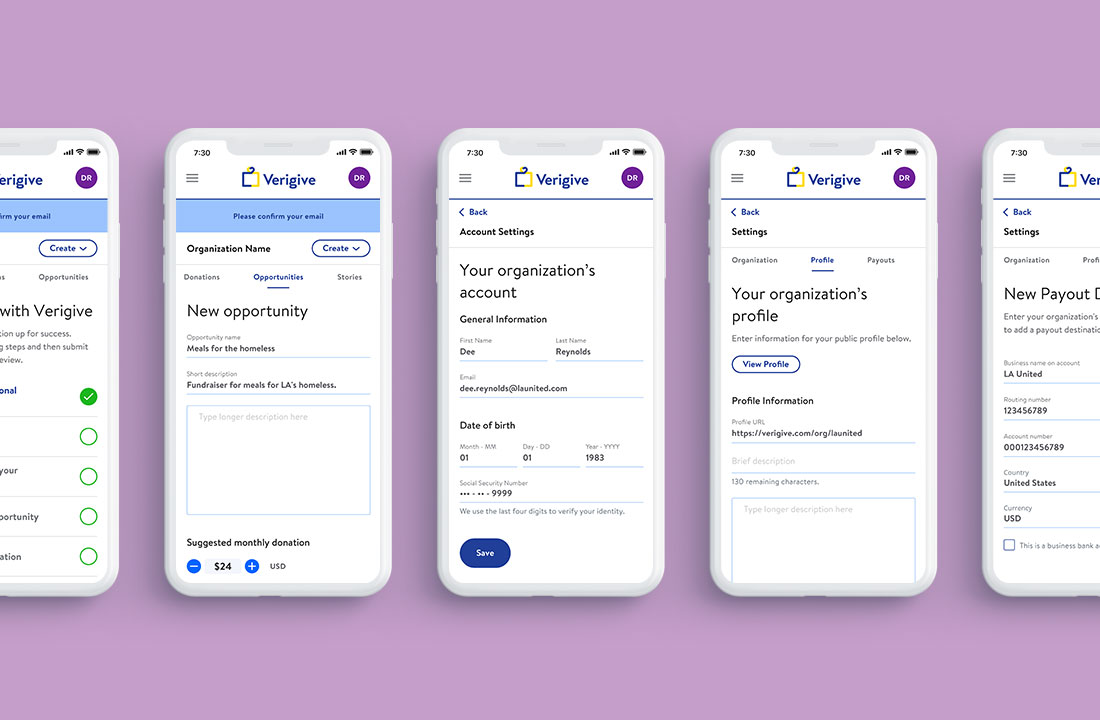
There’s three different types of users I had to consider while working on the website: individual, organization and team. The individual portal is for people looking to find donation opportunities that match their interests. The organization portal is where non-profits can create donation opportunities on the Verigive platform. Lastly, the team portal is where companies can create donation campaigns within a company to encourage employee and employer giving.
Impact
Show your impact
Overall this Verigive project was a lot of fun and something I am proud to be a part of. My client was extremely happy with both the new logo and website. The primary marketing objectives were to onboard 1000 donors in 6 months, and 2000 in the next six, each giving an average of $10 per month to causes they care about. Also, to attract twenty or more non-profit organizations to the Verigive platform. I’m hopeful that each goal will be achieved.