Role
Senior Product Designer at DEPT
Category
- Finance
What I Did
- User Research
- Strategy
- Product Design
Access anytime. Anywhere.
Wealthscape is a web-based execution platform designed to help registered investment advisors, broker-dealers, banks, and family offices digitize their businesses. The mobile app had not been updated in years and was at risk of being removed from the App Store. The goal was to redesign the app to enhance how advisors work more effectively and to align its look and feel with their recently redesigned consumer app, Wealthscape Investor.
Over five months, I helped define the mobile strategy and redesigned a once-struggling legacy app, generating excitement and securing resources for its redevelopment.
I worked closely with project managers, the mobile designer of Fidelity’s Wealthscape Investor app, and engineers.
Impact
Dramatically improved the Wealthscape app’s App Store rating from 2.2 to 4.8.
PROBLEM #1
Lack of on-the-go access to key data made it difficult for brokers to do their jobs when away from the office.
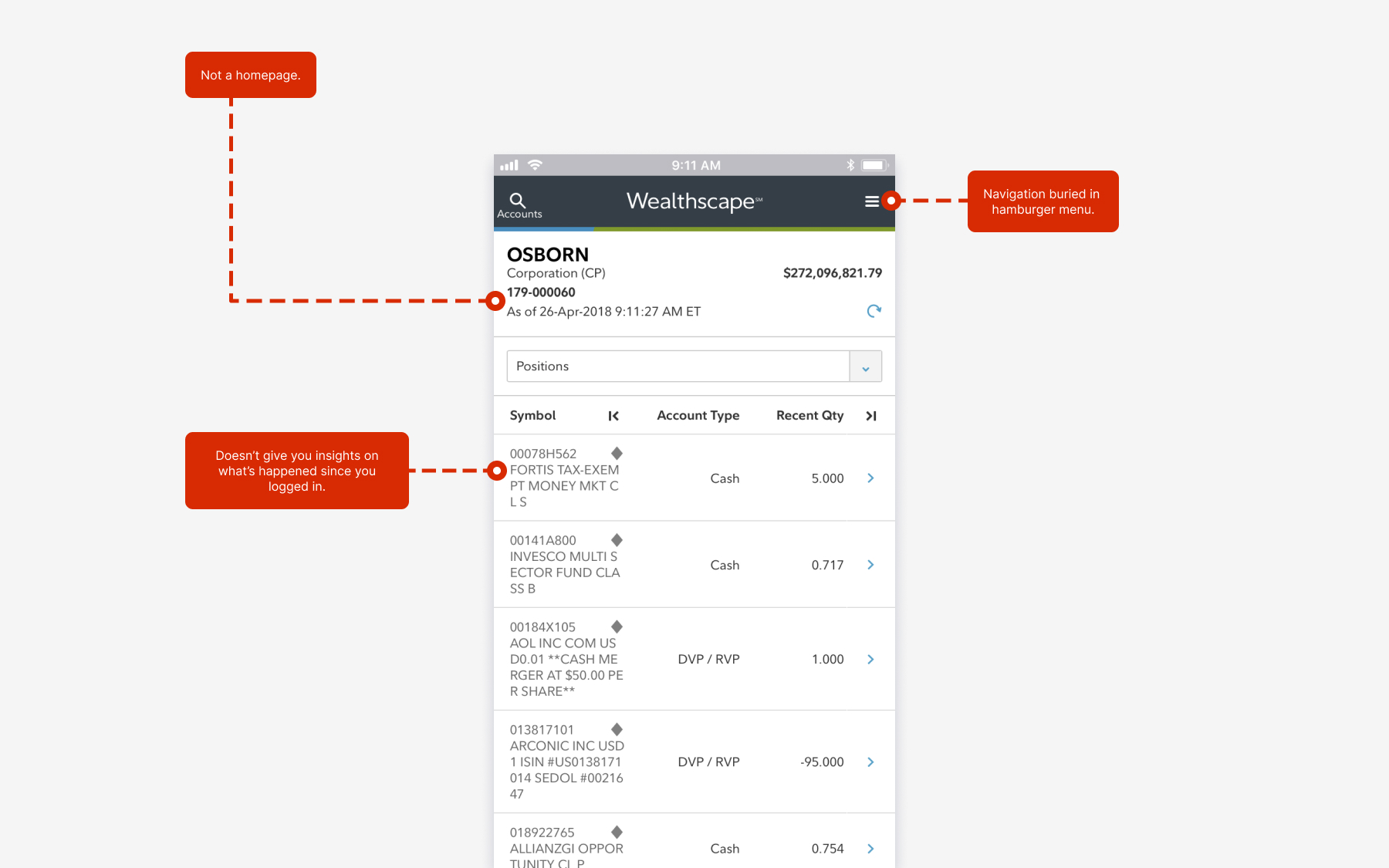
Homepage Challenges
Things To Consider
How do we enable advisors to access and see key information while away from the office? That was the main focus in developing a useful and informative homepage.
User Research
I led qualitative research with Customer Service Managers (CSMs) to better understand our target audience—their clients. This included their current and desired application experiences, pain points, opportunities, unmet needs, unspoken behaviors, and key moments, all aimed at creating the optimal investment advisor experience.
Research Findings
My process for New Homepage Experience
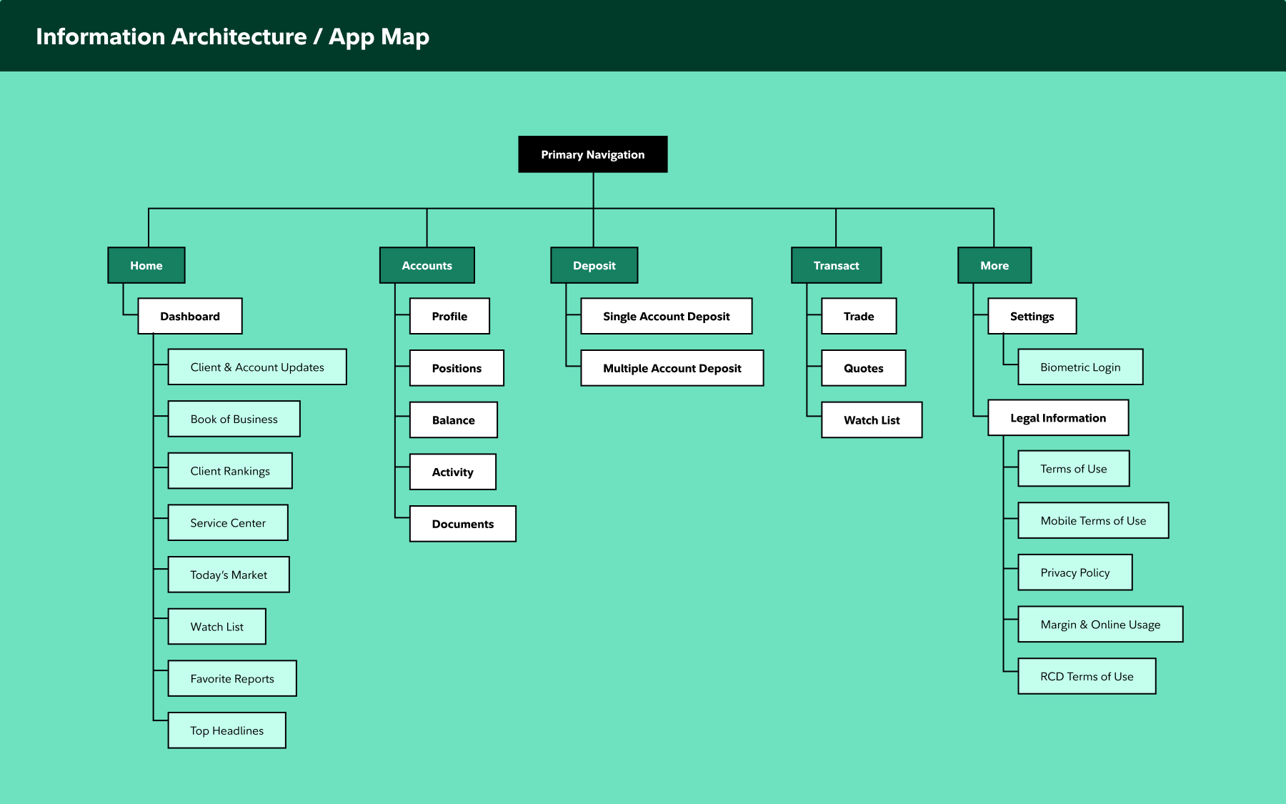
My initial step involved crafting a navigation flow that was straightforward and easy for users to move through, ensuring a smooth transition from one section to another.
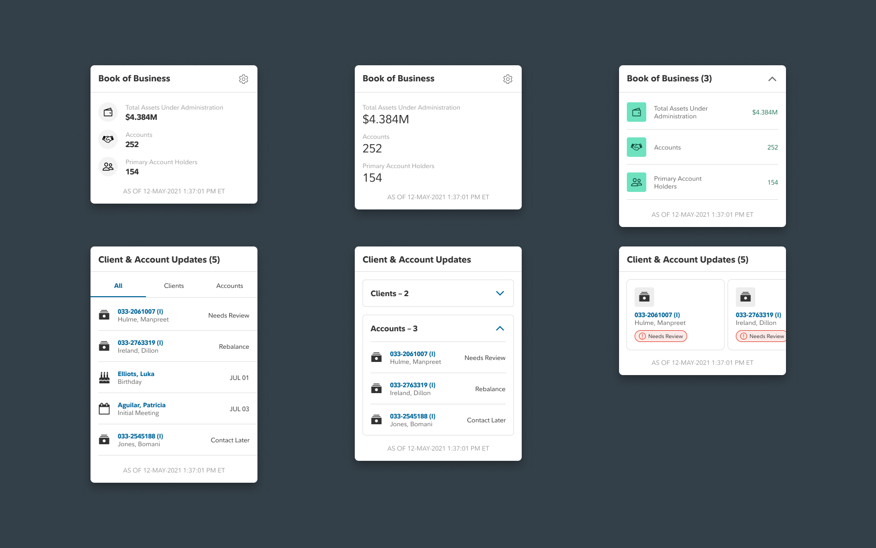
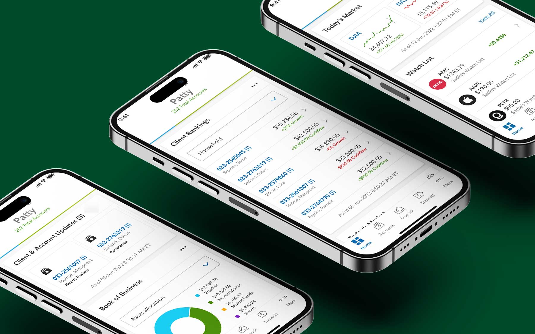
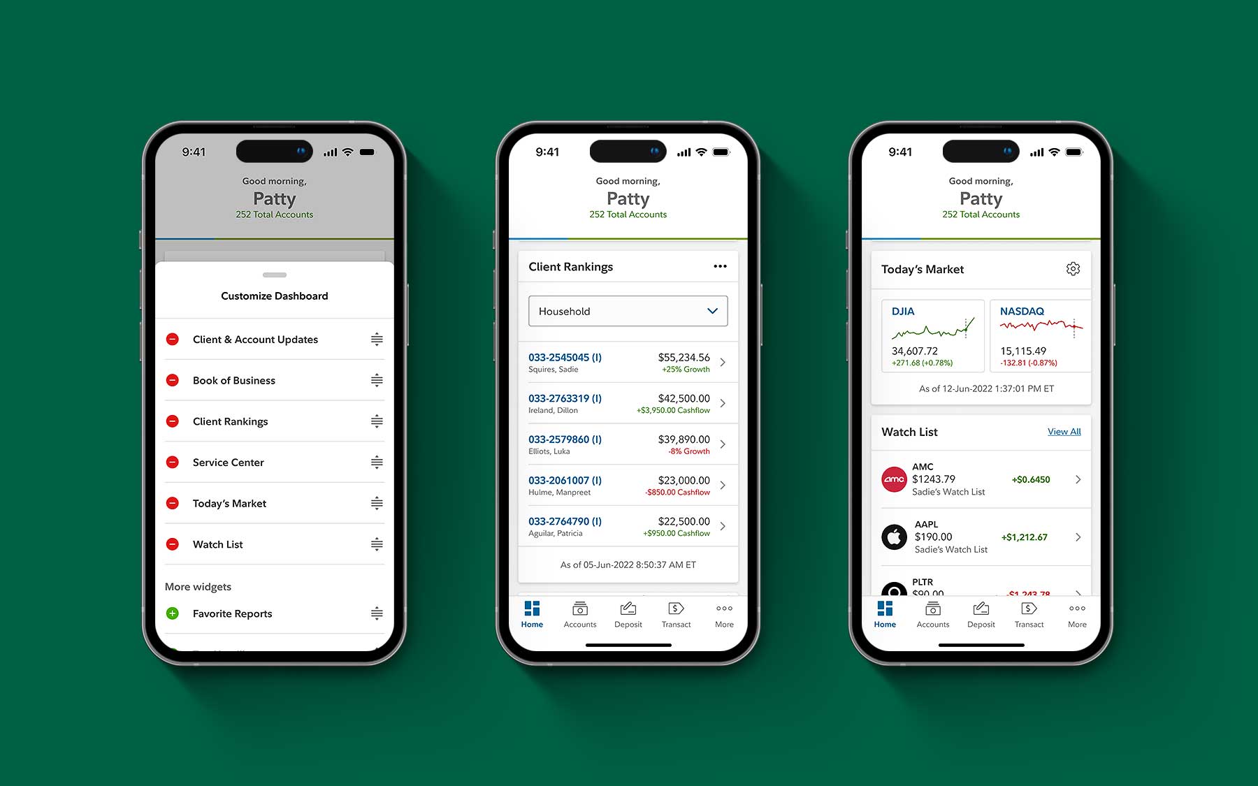
Next, I needed to determine which insights from the desktop experience would be beneficial for the mobile app. Then, I explored using the design system of the Investor app to create new design experiences for Wealthscape, such as implementing a card system on the homepage.
New Homepage Outcome
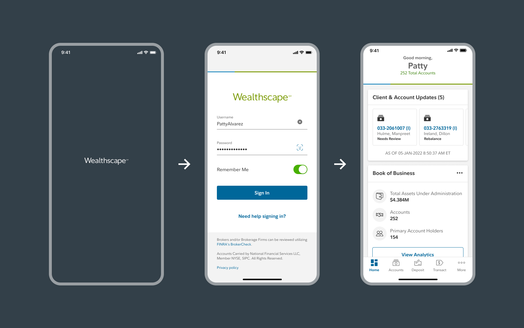
The new navigation structure is optimized to help users easily move through the app and is designed to scale as new features are added to the platform. The homepage design leverages personalization, allowing advisors to customize their view to see what's important to them.
PROBLEM #2
How to enable advisors to stay up-to-date on how their client’s account is performing?
My Hypotheses (Account)
My process for Account
I focused on balancing enhancements in user experience with feasible development solutions. Discussing my design ideas with developers early on was crucial, as it helped us promptly identify potential issues.
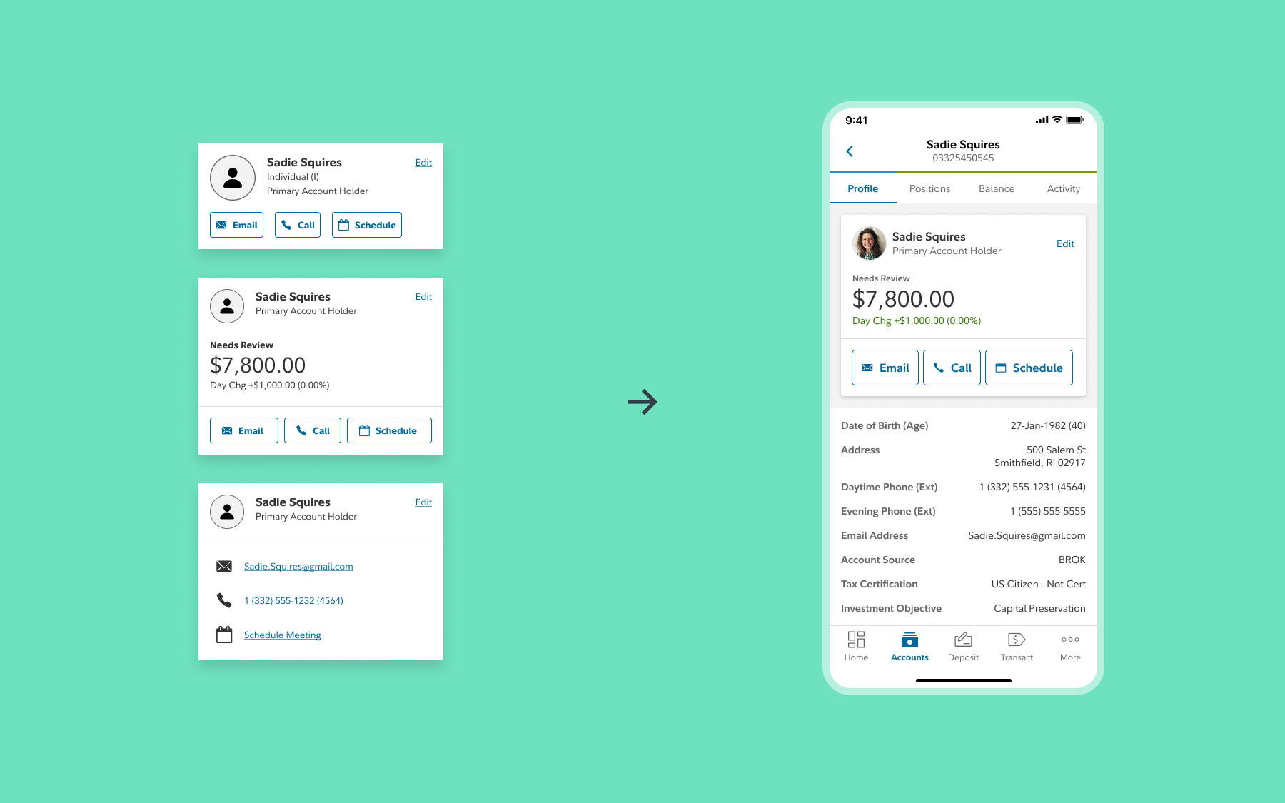
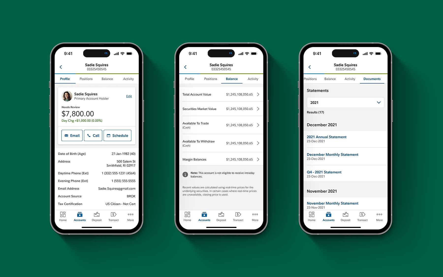
I explored ways to visualize the various types of information and functionalities that could be included in the account profile for the minimum viable product (MVP).

Account Outcome
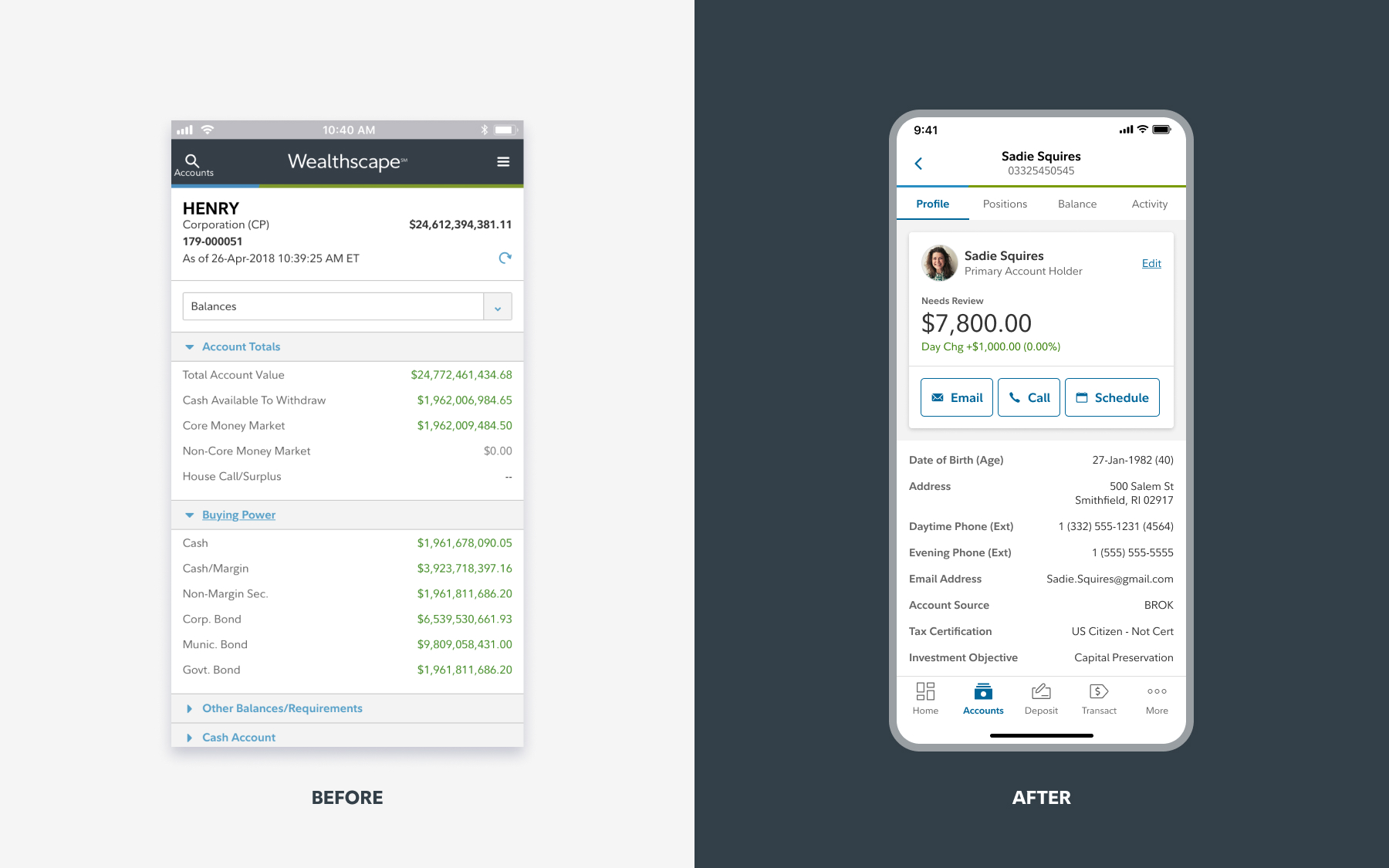
The new account experience added fundamental features such as viewing account positions and statements, bringing the app up to par with industry leaders like Merrill.
Unfortunately, more advanced features, such as scheduling meetings in the app via APIs, were not included in the MVP relaunch but can be incorporated in future updates.
PROBLEM #3
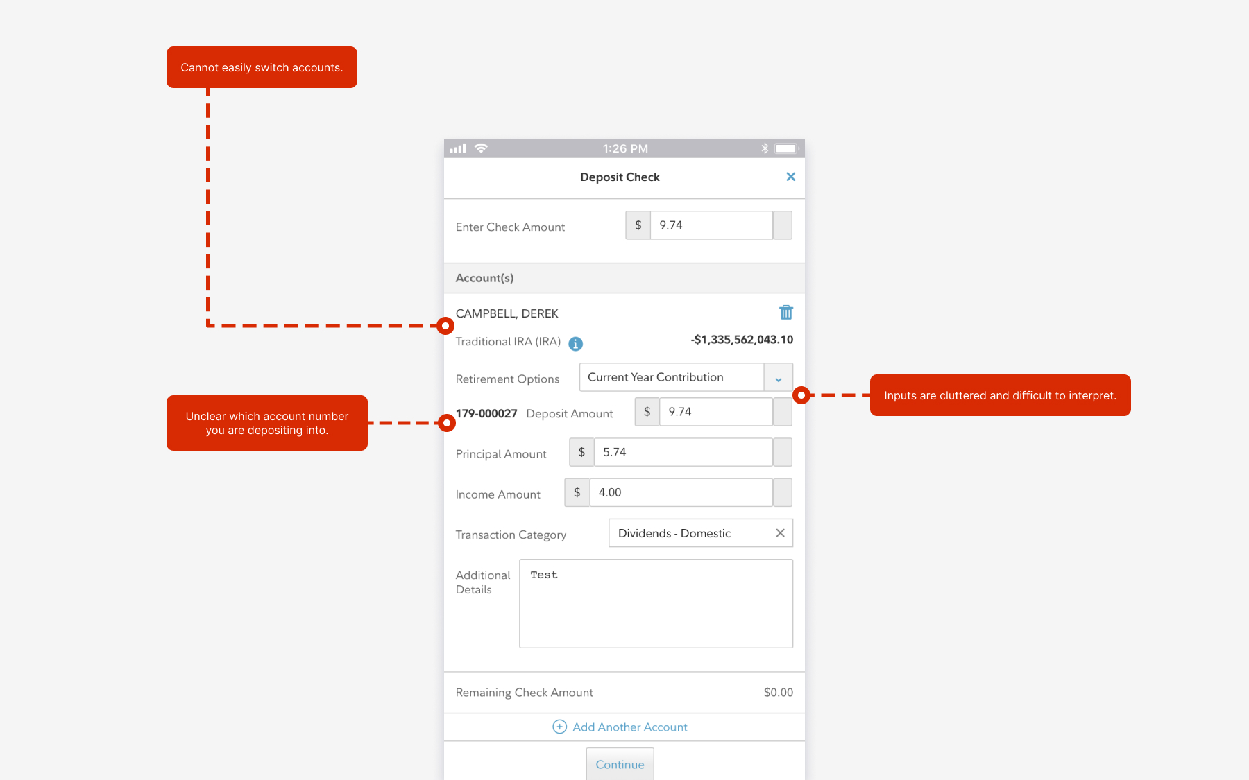
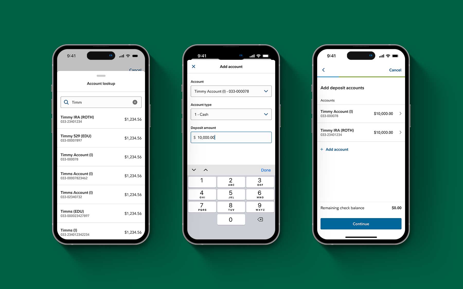
The old Remote Check Deposit (RCD) experience wasn’t intuitive and didn’t allow you to deposit funds into multiple accounts.
RCD Challenges
Things To Consider
Remote check deposit utilized a third-party API to enable mobile depositing within the app, but the process needed simplification.
A major requirement for the revised version of remote check deposit was to create a seamless flow for allocating funds into multiple accounts. Advisors often needed to disperse a client’s funds into more than one account.
My process for Remote Check Deposit
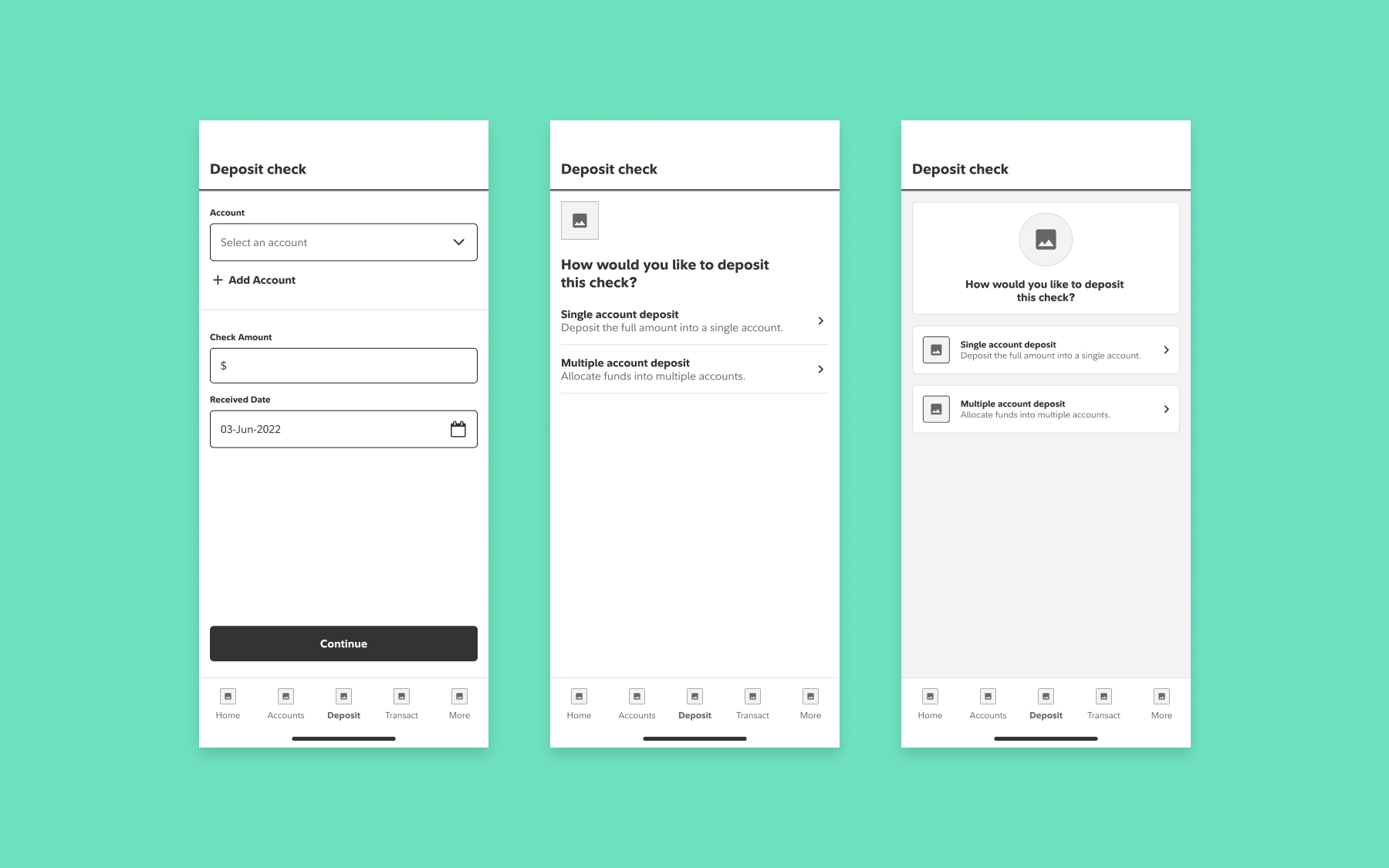
To address the need for allocating funds into multiple accounts, I explored ways to establish clear paths for both single and multiple deposits. Check Deposit was also a new feature for Wealthscape Investor (the consumer app), so the mobile designer for Wealthscape Investor and I worked closely to develop flows that could be built once and applied to each app.
After our initial explorations, it became clear that the two-path approach would be an efficient way to add the feature without requiring a significant technical lift.
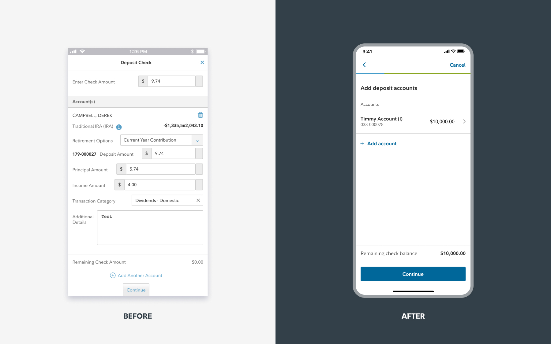
Check Deposit Outcome
The new Check Deposit feature was successful in adding a capability that clients had long desired. It represented a significant first step towards improving the on-the-go experience for advisors. Based on user feedback, a valuable addition for future updates would be to make past transactions visible.
Impact
App Store Rating Skyrocketed from 2.2 to 4.8
It was incredibly rewarding to see how the user research and product strategy I helped implement led to dramatic improvements in the app. The work I led also generated buy-in and investment from Fidelity’s internal stakeholders. Conducting ethnographic studies would be an excellent next step to gain deeper insights into what can truly transform how users in this space work.

